I’m a native Californian. As such, my vocabulary is flavored by my West Coast upbringing: one part Southern California and one part Bay Area. If you and I are talking about our team or target market, odds are good that you’ll hear me talk about our “peeps.” And yes, the 1980’s valley girl in me still likes to say “totally”!
Our vocabularies may change over time, but if we listen to ourselves for a little while we will start to hear a few trends in the words we use. It’s the same with our visual vocabulary!
What IS a visual vocabulary?
Our visual vocabulary consists of the pictures and visual icons that represent ideas and concepts to us. As far back as our cave-person ancestors, people created cave paintings and rock carvings of important icons in their everyday life: animals, other people, and themselves.
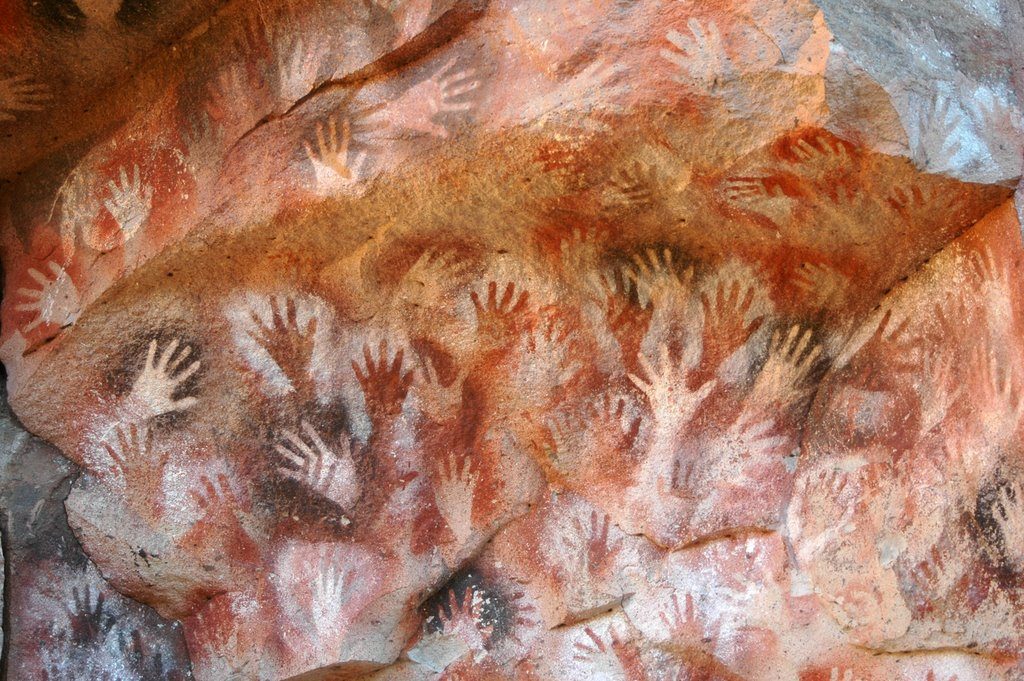
These icons held rich meaning for their creators and for the folks they were created for. They captured and retold the stories in their lives worth remembering.

Icons can be the same for you as well. They can be the images through which you tell your own stories!
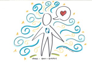
When communicating visually, our icons are our words. We typically communicate with icons to represent the things most important to us. The process to do so may be easier than you expect: simply combine basic lines and shapes to create an icon to visually represent a person, place, thing or concept! The images don’t need to be particularly complex or detailed. . . they simply need to be good enough to get the idea across!
Five of my favorite icons
When I engage in visual conversations certain icons tend to pop up. . . here are five of my favorites. (If I take “hearts” off the table, of course. . . hearts show up in practically every single thing I draw forth! I’m so fortunate to get to work with people who are passionate about their projects!)
 Light bulb = idea: we all have ideas…in fact, when I work with clients it’s ALL about taking everyone’s ideas and showing how they all connect, or helping them to see the differences in their perspectives so that they can connect and come to an agreement. You can imagine how often a light bulb comes in handy in my visual vocabulary!
 Target = goal: Often in a visual conversation we have a goal in mind…where do we want to end up? What are we shooting for? When we think about where we want to go and how we want to get there, I can’t help but think of an archer at the ready with a steady arrow aimed right at a target. See how I added a little Jeannelie flare to the icon simply by adding legs? Voila! Instant archery target! (You can take a commonly used visual icon and make it your own too! Just do what feels right to you.)
 Person = anybody and everybody: How you draw a person in your visual vocabulary will be very personal to you. I have always gravitated towards a fun and rounded look when drawing people. The beauty of communicating with a visual vocabulary is that you don’t have to be an art major to be able to draw people. You can draw a stick figure and people will get the idea! Plus, your people can “look” the same and still represent different individuals simply by adding a key detail or even a work with an arrow to identify who it is supposed to be! Start drawing a person and see what happens…you might find your visual icon of a person is very unique to you.
 Speech Bubbles = literal comments: Sometimes someone says something that is too perfect or powerful to translate into something else. That’s okay. . . you can add a speech bubble around the words and now you get the best of both worlds! This icon comes in handy so often and allows me to create visual context around words that really matter. A win-win for everyone!
 Sunrise = vision, desired future state: We all have a vision of the future; we may not talk about it all the time, and it may not be as clear as we would like, but it’s there. When having visual conversations, it can be really powerful to get everyone thinking in the future and the idea of a road leading to a sunrise can do just the trick. Think of what you would use to convey the future. . . find what speaks to you and add it to your visual vocabulary!
Building your vocabulary. . . one icon at a time!
Remember that we are always building our vocabulary. Ultimately you choose how much your vocabulary will grow each day and the same goes for your visual vocabulary too. Take some time to draw out your favorite visual icons. If you need some help you can always check out my book Draw Forth, and I have lots of great posts you can check out in my Good Enough series.
Which icons are the favorites in YOUR personal visual vocabulary? Comment below and show me the ones you love to use!
I cannot wait to see what you draw forth!


As usual, very interesting! I would like to share a thought with you. It’s about a year I’m reflecting on these “meaningful visual elements” that create our Visual Vocabularies. Particularly I found that I can have different vocabularies: a) Personal: all those symbols that have a defined meaning to me. Eg. those I use in my personal prj management notes. They are a sort of “secret codes”. b) Relative: everything that has a meaning related to a context. Just think about a symbol depicting a cloud in different contexts such as meteo, IT, storytelling… Finally c) Universal: those symbols that works like words, eg. the light bulb for idea, a paw print for dog, arrows, question mark and so on. Each of those symbol evocate a “universe” of other related symbols. I think we need to bear in mind this when we draw to communicate. When we have a visual conversations we need to use an appropriate visual language in order to deliver the “right meaning”. With “right meaning” I mean that what the visuals convey is exactly what I intend to express. Given this a bad visual delivering a right meaning beats a good visual delivering a wrong meaning every time! My 2c.
Very true, Mauro. I think about the language/vocabulary I use to communicate with 1) myself, 2) my boyfriend and family, 3) my friends and community, and 4) my clients. My clients won’t get the inside jokes and meanings behind words or phrases in the same way that my family — folks who have known and loved me for a LONG time — would. And NOBODY’s going to get the stuff I jot down just for myself! ;^)
This brings up the difference in modes of practice as visual practitioners. Sketchnotes are typically notes I draw “for me,” so I’m going to use my own visual language that holds power and meaning for me. Others may look at what I draw and not quite get it, and that’s okay: it wasn’t created for them, it was created for me. It can be a mistake, then, to do sketchnotes for a client while using your personal level of visual vocabulary: they won’t hold the same level of meaning or understanding for your client as if you used a visual vocabulary that was more easily understood.
This is where the power of graphic recording and facilitation come in: harvesting insights and creating these visual artifacts in front of the group and in real time. Because the insights are being drawn in front of participants, they infuse the icons (visual vocabulary) with meaning in the moment. They know that the squiggle is a snake in the grass, because they were there when it was being discussed. They know that the hump with pointy things is a bunny in the garden. . . because they saw it being created within that context. When done in front of others, we can draw upon more of our ranges of visual vocabulary because we are sharing the meaning with our participants as they are being created. We are bringing them onto the same page with us as we draw.
For communication that doesn’t get that benefit — drawing things up after the fact, separate from the group as a stand-alone product, or drawing out insights in front of a REALLY large group who won’t be able to see what you’re doing — we need to be careful to use visual language that will best communicate the concepts outside of context. Folks viewing this type of communication piece will apply their own meaning and understanding to what they see. Our images need to best support the true intention of meaning with that in mind. This is where our universal icons are going to come into play. Sure, it’s a light bulb. Again. But if it is the best way to convey “idea” on the page for consumers of the information to “get” what’s being communicated in this stand-alone piece, then that’s probably the icon to use. ;^)
Thanks for sharing this! Sparking lots of fun thoughts for me as a result! :^)